I decided to do my presentation on Bradbury Thompson, as he is a designer that has inspired my own personal work in many ways. My major is Graphic Design so his work makes my heart bleed! (in a good way)
He was an American graphic designer and art director of the twentieth century, born in Topeka, Kansas in 1911. To get a basic idea of his talent, "when it came to the blending of photography, typography, and colour, nobody did it better than Bradbury Thompson." He pushed boundaries like no other.
In 1938, he moved to New York and worked with Westvaco Publications to create 'Westvaco Inspirations', a graphic arts publication. This specific publication was intended to demonstrate the printing processes (letterpress and offset lithography) and paper types used. Its primary audience was a mere 35,000 readers/viewers, consisting of designers, printers, teachers and students; so it had a very specific intended target audience.
Seen here are his prints done for the Westvaco publication. He was a master in overprinting, whereby he runs one ink directly onto the previous ink colour in order to create a new third colour. His ability and finish when doing so has since never been matched by any other designer.
His father worked in an industrial print factory, thus he had seen the ins and outs of the process from a very young age, giving him the ability to truly utilize the process over every tiny detail inch of surface. Due to his experience, he had a noble understanding of how to design with consideration of the exact order of printing plates and flow on ink from the printing press.
As seen on the images, his style was simplistic, bold and colorful. The primary aspect to his work was that he used the CMYK model of printing presses to create these beautiful prints. His work often consists of overlapping the CMYK colors, as well as incorporating repetition and a lot of transparencies and silhouettes.
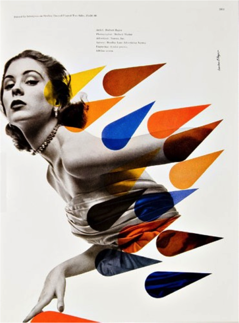 |
| Primary Colour Scenario/Beautiful Blend of Photography and Print, Colour, Shape |
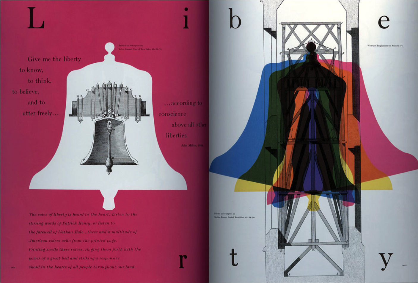 |
| Overlapping Printing: Creating Secondary & Tertiary Colours from Primary Colours |
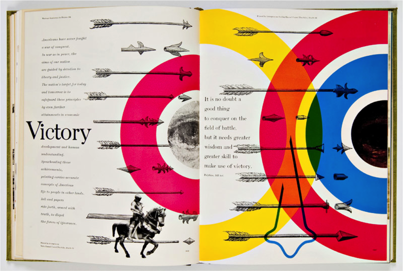 |
| Transparencies & Secondary Colours Created Through Overlapping |
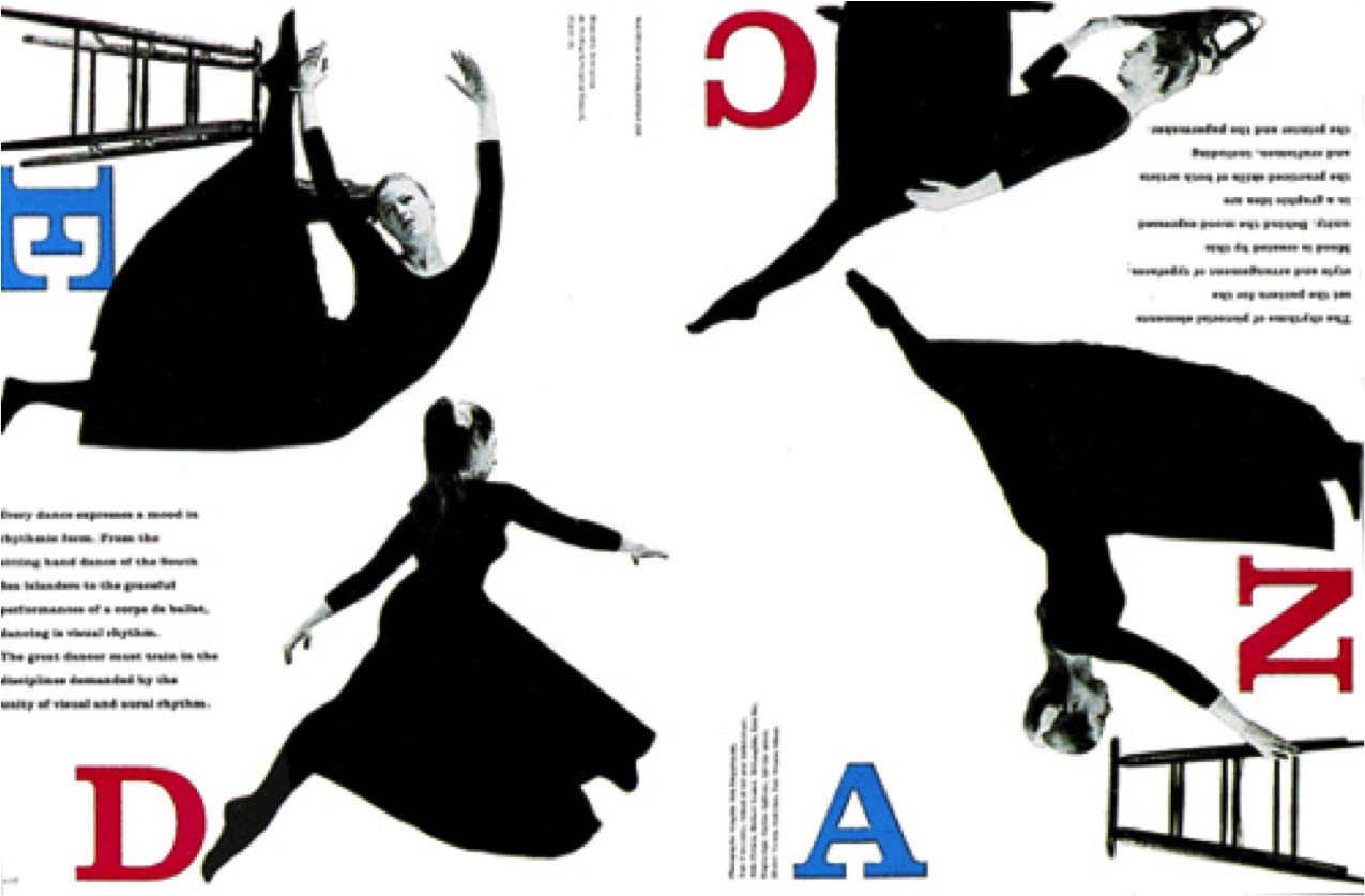 |
| Bold Forms, Shapes, and Arrangement for his Time |
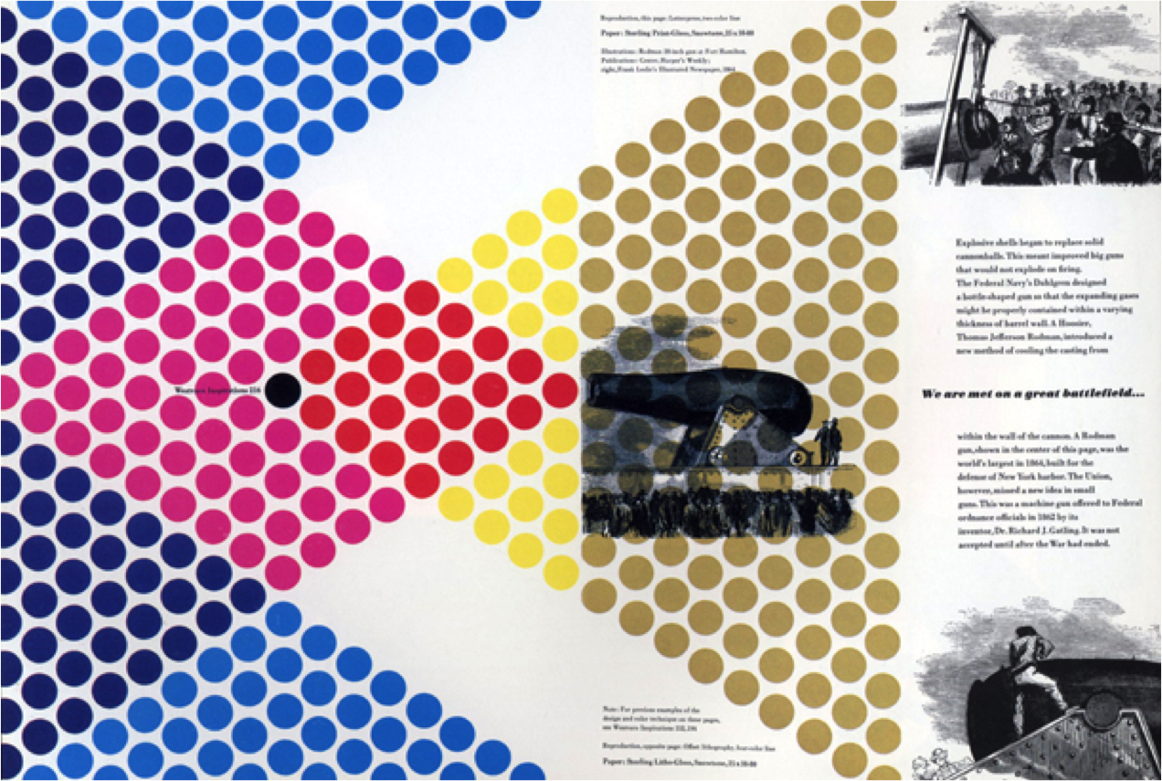 |
| Individual Dots Show Colour Interaction/Replicates CMYK Dot Printing |
He moved on to working with Mademoiselle magazine in New York, and worked with them for 15 years. Here, he worked on blending photography, design and typography like no other in his time. The final images are elegant and refined, and still hold true to the standards established in the fashion world to this day. His work can be seen on the image below. During this time period, he actually hired the likes of Andy Warhol, Willem de Kooning, and Jasper Johns to produce illustrations for the magazine.
In collaboration with the US postal service, Thompson designed around 120 U.S postage stamps based on providing a snapshot of American culture. These can be seen below.
Lastly, in 1958, he developed the 'mono alphabet'. He noticed that his son had trouble reading and understanding letters of both lowercase and uppercase as one. Thus, he simplified the letters by eliminating the need for some uppercase/lowercase letters, and merging them to make one in order to make it easier to learn and write. This type was first published in his own Westvaco Inspirations print.
Overall, in this day in age, there is a very large gap between designers and printers. Designers no longer have the same physical control over printing like they did before, thus making it incredibly difficult to replicate Bradbury Thompson's unique images. He spent his last 40 years teaching at Yale University, and has passed on his knowledge and inspiration to many a world.


No comments:
Post a Comment