Sunday 22 March 2015

The Colour of The Dress


WHAT COLOUR IS IT?

Although this isn't a part of the course, I included it in my presentation as I thought the issue came right around the perfect time for us Design 2 students. The issue with 'The Dress' was some people saw it as blue and black while others could see white and gold. Why? Because light and colour work hand in hand to trick the brain. Scientifically, the difference in perceptions was largely based on the environment the viewer was in. If he/she was in a blue lit room, supposed next to a window in daylight, the colour of the dress would look white and gold due to light reflected from the blue sky. However, if he/she were viewing the image in an artificially lit room whereby there would be a yellow light, the dress would be seen as black and blue.

The actual colour of the dress in real life?
BLACK AND BLUE!

Source:
https://www.youtube.com/watch?v=AskAQwOBvhc

Friday 20 March 2015

Drawing Project


For my final project for my figure drawing class, I was inspired by artist Josh Bryan to create the following image. He uses a method called triangulation to geometrically construct a portrait. Part one of the project consisted of copying a piece identically but on a larger scale. My copy is seen above on the Marilyn Monroe print. The second part of the project was to use my own chosen image, and recreate the artists' style with my own touch. I chose to recreate Malificent, and took inspiration from my own doodles/designs to create the dark tones of the image. While Josh Bryan uses only single linear marks to create tone, I used a multitude of designs to do so. The entire project was done in micron pen, so it was quite tedious however I thoroughly enjoyed the details as I am one to stress the small stuff and perfect it! Overall, I am very happy with how my rendering turned out, and I will definitely look to creating similar portraits in the same approach. 


Bradbury Thompson Presentation


I decided to do my presentation on Bradbury Thompson, as he is a designer that has inspired my own personal work in many ways. My major is Graphic Design so his work makes my heart bleed! (in a good way)

He was an American graphic designer and art director of the twentieth century, born in Topeka, Kansas in 1911. To get a basic idea of his talent, "when it came to the blending of photography, typography, and colour, nobody did it better than Bradbury Thompson." He pushed boundaries like no other.

In 1938, he moved to New York and worked with Westvaco Publications to create 'Westvaco Inspirations', a graphic arts publication. This specific publication was intended to demonstrate the printing processes (letterpress and offset lithography) and paper types used. Its primary audience was a mere 35,000 readers/viewers, consisting of designers, printers, teachers and students; so it had a very specific intended target audience. 

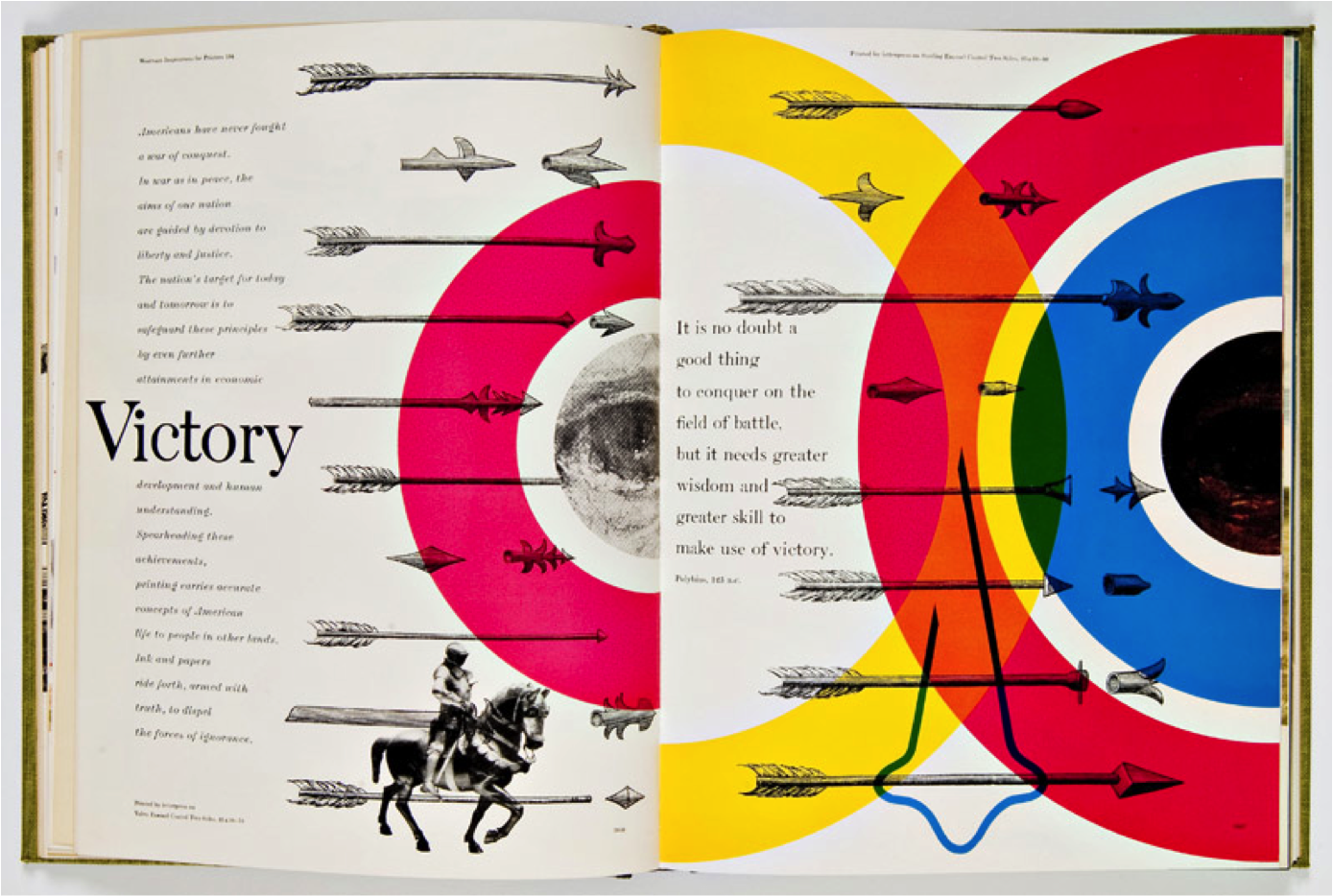
Seen here are his prints done for the Westvaco publication. He was a master in overprinting, whereby he runs one ink directly onto the previous ink colour in order to create a new third colour.  His ability and finish when doing so has since never been matched by any other designer. 

His father worked in an industrial print factory, thus he had seen the ins and outs of the process from a very young age, giving him the ability to truly utilize the process over every tiny detail inch of surface. Due to his experience, he had a noble understanding of how to design with consideration of the exact order of printing plates and flow on ink from the printing press.

As seen on the images, his style was simplistic, bold and colorful. The primary aspect to his work was that he used the CMYK model of printing presses to create these beautiful prints. His work often consists of overlapping the CMYK colors, as well as incorporating repetition and a lot of transparencies and silhouettes. 

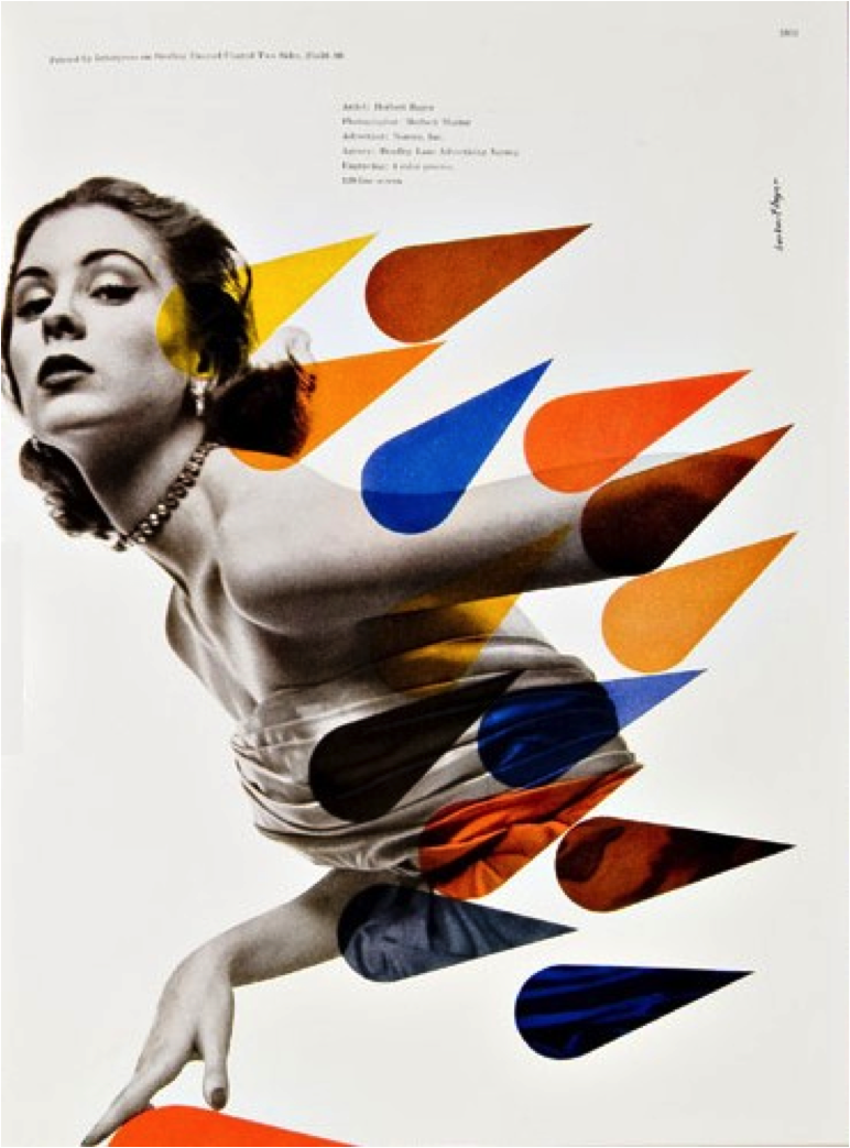
Primary Colour Scenario/Beautiful Blend of Photography and Print, Colour, Shape
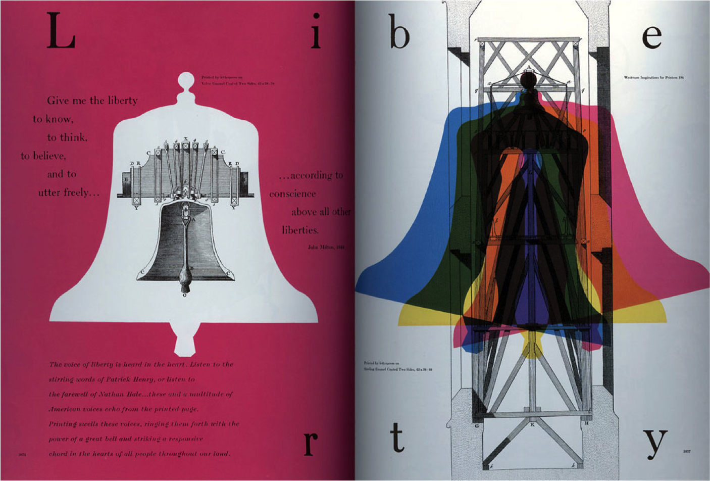
Overlapping Printing: Creating Secondary & Tertiary Colours from Primary Colours
Transparencies & Secondary Colours Created Through Overlapping
Bold Forms, Shapes, and Arrangement for his Time
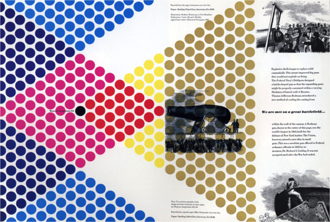
Individual Dots Show Colour Interaction/Replicates CMYK Dot Printing

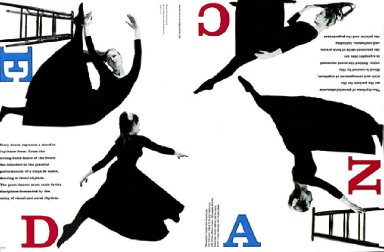
He moved on to working with Mademoiselle magazine in New York, and worked with them for 15 years. Here, he worked on blending photography, design and typography like no other in his time. The final images are elegant and refined, and still hold true to the standards established in the fashion world to this day. His work can be seen on the image below. During this time period, he actually hired the likes of Andy Warhol, Willem de Kooning, and Jasper Johns to produce illustrations for the magazine. 


In collaboration with the US postal service, Thompson designed around 120 U.S postage stamps based on providing a snapshot of American culture. These can be seen below.


Lastly, in 1958, he developed the 'mono alphabet'. He noticed that his son had trouble reading and understanding letters of both lowercase and uppercase as one. Thus, he simplified the letters by eliminating the need for some uppercase/lowercase letters, and merging them to make one in order to make it easier to learn and write. This type was first published in his own Westvaco Inspirations print.


Overall, in this day in age, there is a very large gap between designers and printers. Designers no longer have the same physical control over printing like they did before, thus making it incredibly difficult to replicate Bradbury Thompson's unique images. He spent his last 40 years teaching at Yale University, and has passed on his knowledge and inspiration to many a world.

Assignment 7: Silhouette, Flat Colour & Optical Mixing

Assignment 7: Silhouette, Flat Colour & Optical Mixing

Assignment 7 was primarily based on exploring optical mixtures. An optical mixture is when colors use tiny amounts of two or more colors that visually blend together to create another colour. It can mix either pigmented materials or light. We photographed each other and used the portrait image to create a silhouette rendering to facilitate the optical mixture. This was done through creating a posterized version in Photoshop, which would help us create reductive shapes, which were then graphite-transferred to the final ground. For this project, minimalism went a far way, whereby simple indications of line could establish the image. 

Following the final rendering, I created 2 colour scenarios, whereby each colour scale would be used for the optical mixture using a stippling technique, where the colours appear as one using quantity and environment. My colour study and chosen colour for the optical mixture can be seen below. 

Colour Scenario

Once I had established the colors for the optical mixture, I went through numerous magazines to find suitable collage material which would work well within the scenario I had already created. As mentioned for Assignment 5, I really enjoy working with collage because I think it brings a unique sense of texture and dimension to the final product. With the optical mixture and collage, I used flat colour on the silhouette to create a pure solid ground.

The optical mixture was achieved through a stippling technique, while applying the colour in the quantity established on the colour study. I did a light wash of colour on the background for the mixture, as I didn't want any white space between the dots. 

For the silhouette on the left side, I wanted to create a complementary scenario, using oranges/yellows and a violet. Therefore, I created my optical mixture and collage using similar oranges/yellows, whilst I kept the background violet (not visible in scanned image). I also went for a somewhat 'organic' and 'floral' theme for it. For the silhouette on the right side, I used a primary color scenario to facilitate my silhouette image. I really enjoy how the texture on the collage for the hair resembles an optical mixture in the form of the bokeh dots.

Overall, I wish we had done this project earlier on in the term as it was one of the most enjoyable assignments from all. Although it took on a simple and minimalistic approach, I really love how everyone was able to use the 3 forms of colour (mixture, collage, flat) to create something unique, which portrayed their own style/attitude. I really enjoyed this as the last project of the term, and it ended on a great note!

Assignment 6: Transformation & Metamorphosis with Environmental Colour Representing a Sequence of Events

Assignment 6 was based on creating a panoramic design that facilitated a transformation and metamorphosis using sourced colour. We started by developing colour in a new way. Instead of using the colour aid to develop colour studies from our imagination or liking, we developed colour through three different sources. These being an object from nature, an old master image, and a personal photograph. We used the colour aid to pull colors and match the quantity and environment from the original images. I really enjoyed this method of pulling colour and developing a colour scenario as it created such unique colour scenarios, which I would not have been able to achieve otherwise. My colour studies and source imagery can be seen on the image below.

The final panoramic design was based and built upon an antonym. I chose to go from rectilinear to curvilinear as I felt this could facilitate a really smooth transformation over 6 panels. I created three sketches to facilitate designing my antonym transformation. These can be on the image below. Through the design, I wanted to incorporate scale, repetition, balance, overlapping, and focal points to create a visual pathway to lead the panorama.

Upon rendering one of the three sketches, I chose a final composition that I felt would best showcase a metamorphosis. I sketched the final design onto the final ground in preparation for painting. For this project, the colour relationships mimicked the colour studies created previously. It was slightly overwhelming to think that I would have to work and facilitate so many colors in one design, however through continuous readjustments, I was able to decide on how to do so.

In terms of colour application, this colour studies that were established had to facilitate the following criteria when added to the final ground.

  • Area defining space and form (through tinting and shading)
  • Transparencies
  • Illusions of Transparencies
  • Collage/Mixed Media
  • Colour Discord (focal points)
  • Hard Edge (through contrasting colors)
  • Vanishing Boundary (through placing two similarly saturated and valued colors next to each other)
  • Vibrating Edge
  • Tetrad System of Colour
  • 11-step Complementary Scale
Overall, I thoroughly enjoyed this project as it was one which allowed for individual expression, making each project unique. I really enjoyed creating my motif for it, and pulled inspiration from previous projects and personal doodles. This was the first time I have worked and balanced such a huge amount of colour together at once, hence I did find it difficult at first to facilitate the color scenarios. I found that my initial designs were separating the color worlds to abruptly, creating individual panels instead of a panorama. However, through re-renderings and continuous changes, I was able to achieve my transformation from rectilinear to curvilinear in an effective manner.

Assignment 5: Transparency & Motif Study


Assignment 5: Transparency & Motif Study

Transparencies and Multiple Mediums Used to Create a Complex Motif

This assignment was based on creating an asymmetrical motif in order to facilitate transparencies as well as multiple mediums such as paint, collage, or colour aid. The project started by building upon the foundation of the assignment. We spent class time to experiment with different colour aid to find and create a colour study that gives the illusion of a transparency. This transparency was created from 3 different colors, overlapping the 2 preferably complementary colors to create an illusion of the transparency it would make. Upon establishing this colour study, I went on to create a colour world that would work with the existing study,, which helped to build colour tones from. Although there was not a strict form of gradation, there was a loose sense of gradation created from pure to neutral to pure colour, keeping in mind colour principles of quantity and environment. My colour study and colour world can be seen on the image below.

Colour Study & Colour World

Following the development of the above study, I proceeded to create an asymmetrical, linear design in order to facilitate the colour world created. My design was non-objective, linear, using angled lines and curvilinear lines throughout. I included aspects of balance, repetition, scale shifts and a main focal point, while weaving in aspects of interlocking/overlapping shapes to facilitate the transparencies. After numerous renderings, I reached my final design which can be seen in the first image above.

I completed my design using not only paint, but also collage which was matched to the colour aid in the study. Personally, I really enjoy incorporating collage in my designs as I think it brings added texture and dimension to the overall design. Whereas, if I just use paint, it may render the image quite flat at times. However, I did find it difficult at times to find collage that would facilitate a transparency. 

As for transparencies, I did this through the illusion of transparency through opaque paint, as well as using transparent paint to create the transparency itself. With the opaque paints, I mixed 50/50 of each overlapping colour to create the transparency in between. With the transparent paint, I mixed the colour with matte medium. Personally, I found it slightly difficult to visualize areas of transparency in my head, before applying the paint, so I had to repaint some areas several times before achieving the desired transparency.

Lastly, we scanned in our final composition, and created a digital symmetrical composition which can be seen below. We did this by copying the original image over 4 times and flipping the image each time. I rotated my image a few times to explore the various symmetrical configurations it would produce. Seen below are my two preferred configurations. 

Digital Symmetrical Composition 1

Digital Symmetrical Composition 2

Overall, I really enjoyed this project as it included working with collage as well as digital rendering. I appreciate using and experimenting with different mediums as it allows me to explore something that I would not normally use. I think this project came out nicely, however, if I were to do it again, I would have created more transparencies to improve my skills in that area. 

Assignment 4: Complementary Colour

Assignment 4: Complementary Colour

Assignment 4 was based on creating complementary colour scales, and applying the scales to a three dimensional form. I started off by using the colour aid to pick 3 complimentary colour pairings, towards which I would match my paint colour. The pairings were yellow/violet, blue/orange, red/green. The chosen colors were those of high intensity and saturation to ensure the neutrals are as pure as possible. 

Once I matched my paint to the according colour aid, I mixed the complementary colors together 50/50 in order to create the extreme neutral. Using this neutral, I went backwards moving towards yellow intensity by adding more of the yellow pure colour. I repeated the same step by adding violet to the neutral to create a gradation from neutrality to intensity towards violet at the end. The same process was continued for the blue/orange and red/green scales as well. This 11-step complementary scale can be seen below.

11-step Complementary Colour Scale

Following the gradation, we went on to creating a form to facilitate two of the three complementary scales created above. I chose a polyhedron template from www.korthalsaltes.com, which was rescaled to a larger size. Upon building a mockup version of the polyhedron, I sketched out my design on the template which I would then transfer onto the final product. I chose a very simple design as I wanted for it to work well with the overall form while facilitating the scales in an effective manner at the same time.

In order to craft my form well, I created a skeleton for the polyhedron by creating it out of bristol paper first. Next, I cut each individual diamond shape for the illustration board and attached it to its respective location. Although this was more time-consuming, I believe it gave me great craft quality. I actually really enjoyed building the form, to my surprise. I painted the form once it was built, which made it quite difficult to handle as it was not a conventional shape. Due to the fact that a large amount of the polyhedron was painted in neutrals, I chose to facilitate the 4 pure colors on a single panel together, as it really livened up the piece, and introduced a focal point. The final product can be seen in the first image above.